Case Study
Silk Title Co.
Problem
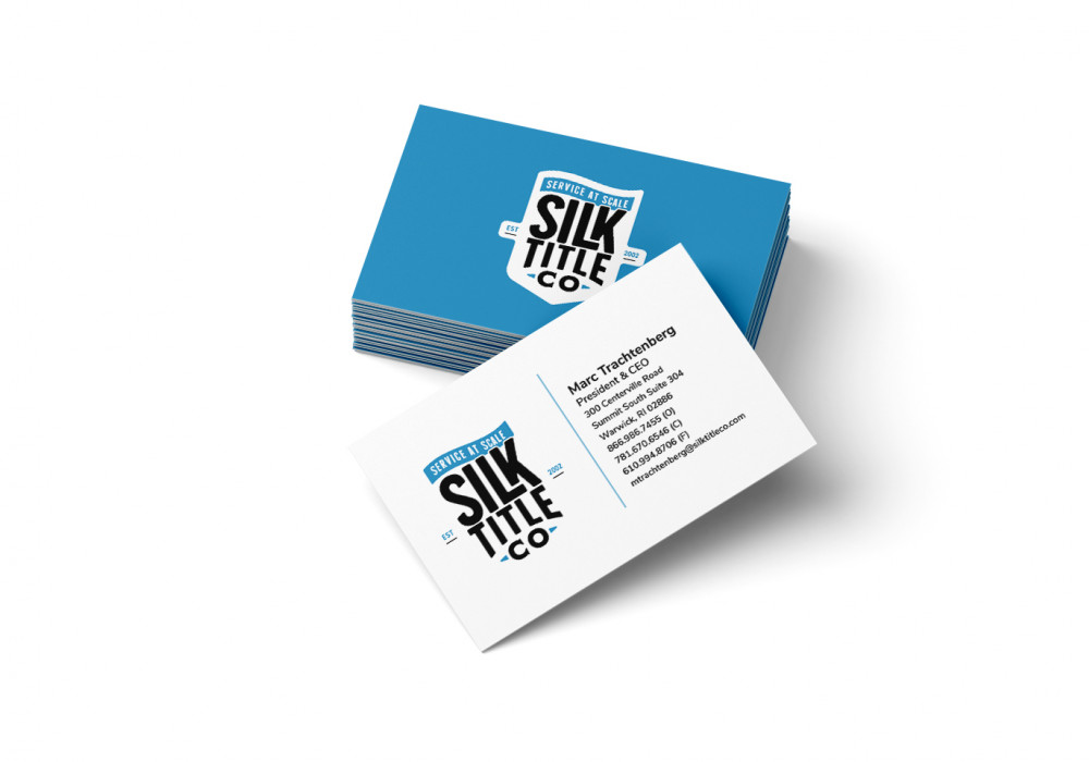
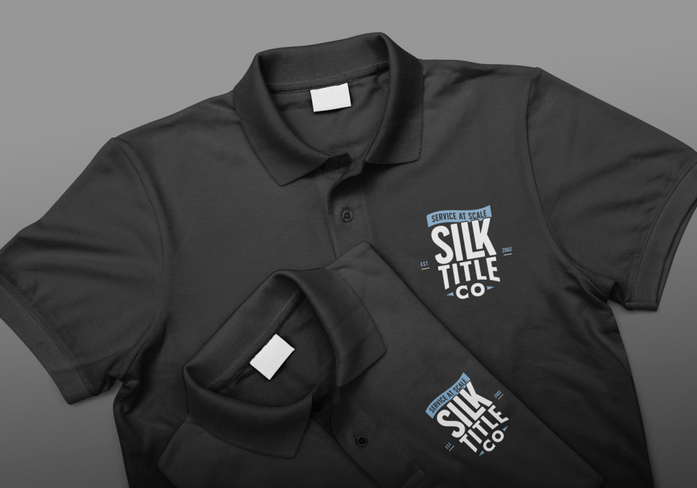
Silk Title Co. had a unique product but not a unique brand. Their logo was from a stock photo company and not reflect who they were as a company Which was a high-tech software automation company that streamline the process of handling titles for mortgage companies.
Solution
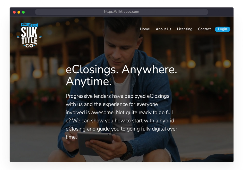
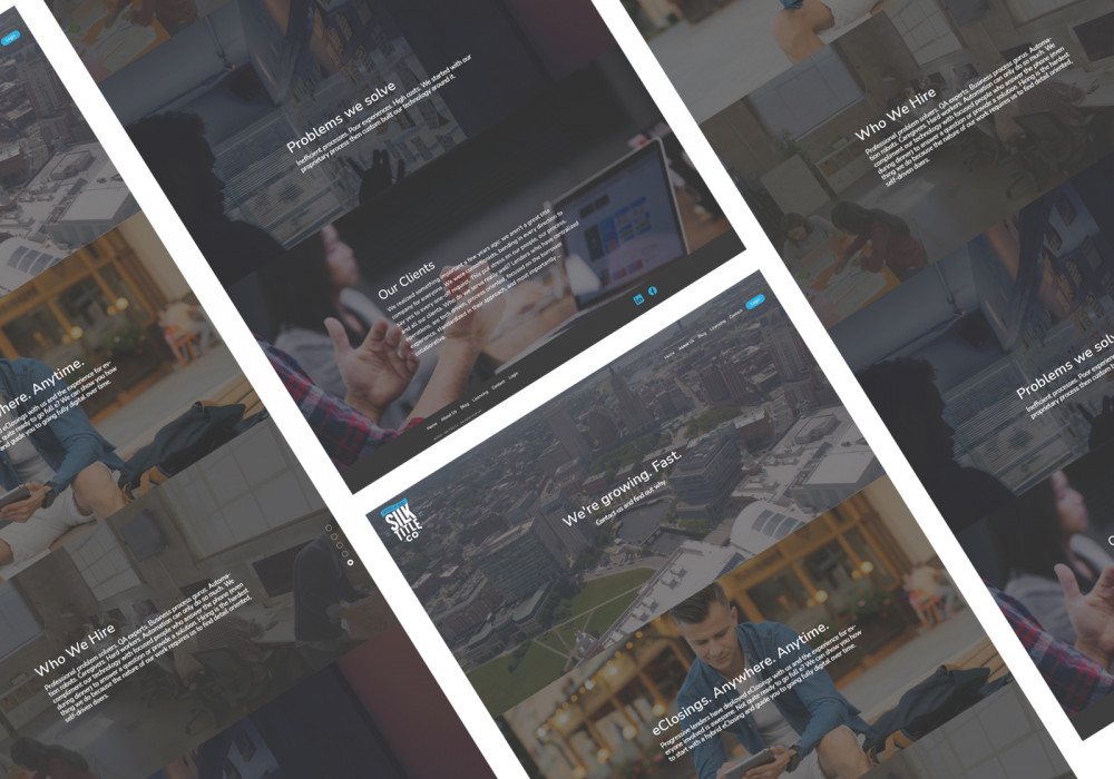
They went under the moniker silk software, so one of the first step was to name them something that reflected the market they served. Silk Title Co. became the moniker that they would go to market with. The blue colors and a badge logo signified trust their customers could count on. Using quality photography and visuals gave their look The upscale quality that they wanted to imbue.